 Add to Chrome
How to Build High-Converting Landing Pages (and Ship Them in Hours)
The core anatomy of high-converting landing pages: value hooks, the 'so what?' test, overcoming objections, and how to turn world-class UI inspiration into clean code with Trace UI.


Most landing pages fail not because of poor products, but because they are designed like mini-websites instead of conversion engines. Visitors arrive, get hit with vague marketing jargon, wander through multiple navigation links, and leave without taking action.
A high-converting landing page is completely different: it has one job, one clear message, and one irresistible call to action.
Website vs. Landing Page: Know the Difference
Before touching Figma or your code editor, understand this crucial distinction:
- A Website is an exploratory directory. It invites visitors to browse: read the "About Us" page, explore multiple products, read case studies, or check job openings. It has dozens of internal links and exit points.
- A Landing Page is a hyper-focused conversion tunnel. It is engineered for a specific campaign, visitor intent, or product proposition.
Every extra link on a landing page is a leak in your funnel. A visitor should only have two real choices: take the desired action or leave.
1. Win the "5-Second Test" Above the Fold
The hero section (everything visible before scrolling) is where 80% of visitor decisions happen. If someone cannot figure out what you do within 5 seconds, they bounce.
A high-impact hero section requires three key ingredients:
- The Hook-Driven Headline: Ditch vague buzzwords like "Next-Generation AI for Seamless Synergies". State clearly what problem you solve and who it is for.
- Formula:
[Solve Pain Point] + [Achieve Desired Outcome] + [Without the Usual Frustration]
- Formula:
- The Clarifying Sub-Headline: One or two concise sentences that explain how it works or what the product actually is (e.g., "A Chrome extension that extracts computed styles and components into clean Tailwind CSS with one click").
- The Supporting Visual: Show, don't tell. An interactive demo preview, a high-fidelity app screenshot, or a lightweight video beats an abstract 3D shape or generic illustration every time.
- The Frictionless Primary CTA: A high-contrast button with action-oriented text ("Start Free", "Add to Chrome – It's Free", or "Try the Interactive Sandbox").
2. Apply the "So What?" Test to Every Feature
A common mistake is listing technical specifications and expecting users to connect the dots:
Built on an asynchronous distributed AST parser with sub-millisecond AST transformation.
The prospect's immediate subconscious reaction: "So what?"
Every feature on your landing page must pass the "So What?" test by converting technical capabilities into direct personal benefits.
When writing feature sections, lead with the outcome, explain the mechanism second, and keep paragraphs under three lines.
3. Disarm Objections Before Visitors Form Them
Visitors arrive on your page skeptical. They have seen dozens of tools make bold promises. To convert them, you must dismantle their hesitation right where it crops up:
- "Is this hard to learn?" → Show a 15-second visual workflow or a 2-step setup diagram.
- "Will it fit my tech stack?" → Display recognizable framework badges (React, Next.js, Tailwind CSS, Vue, Svelte).
- "Is there hidden pricing?" → Highlight "No credit card required" or "Free tier included" directly beneath the CTA button.
- "Does it actually work?" → Add proof points: real testimonials, GitHub star counts, or side-by-side comparisons of raw inspect code versus computed output.
Place an FAQ section toward the bottom of the page to address the remaining logistical edge cases (licensing, updates, support).
4. One Page, One Relentless Action
A landing page should never split the visitor's attention. If your goal is to get users to install an extension, do not ask them to follow your Twitter account, read 4 blog articles, and subscribe to a newsletter on the same screen.
- Keep your button copy consistent from the hero down to the footer.
- Reiterate the CTA after every major proof point or feature section.
- Ensure button colors stand out clearly against your background theme with ample whitespace around them.
The Bottleneck: Designing & Coding It from Scratch
Understanding landing page theory is one thing; actually building a high-converting page is where teams get stuck.
You spend days in Figma pushing pixels, followed by endless hours inspecting competitor landing pages in DevTools - only to find that copying raw HTML gives you broken CSS, isolated classes, and mangled layouts.
This is where Trace UI bridges the gap between landing page inspiration and production code.
How Trace UI Helps You Build Landing Pages Faster
The best founders and designers don't reinvent visual hierarchy from scratch - they study battle-tested landing pages from famous landing pages like Stripe, Linear, Supabase, and Claude, then adapt proven structural patterns to their own brand.
Here is how you can use Trace UI to build your landing page in hours instead of weeks:
1. Capture High-Converting Layout Patterns in 2 Clicks
Found an exceptional testimonial carousel, a high-converting pricing grid, or an engaging feature comparison table on a world-class landing page?
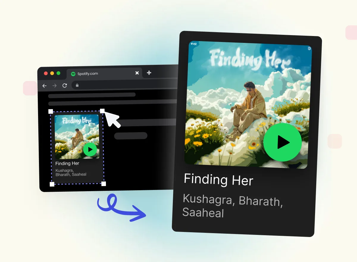
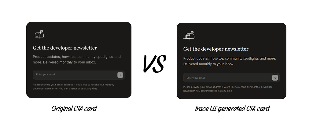
With the Trace UI extension, simply hover and select the element. Trace UI analyzes the computed styles from the live browser DOM and compiles them into clean, production-ready React or HTML code with Tailwind classes.
2. Extract Design System and Foundations Instantly
Consistency is the secret to a polished landing page. If your buttons, cards, and typography use inconsistent paddings or random hex codes, the page feels amateurish.
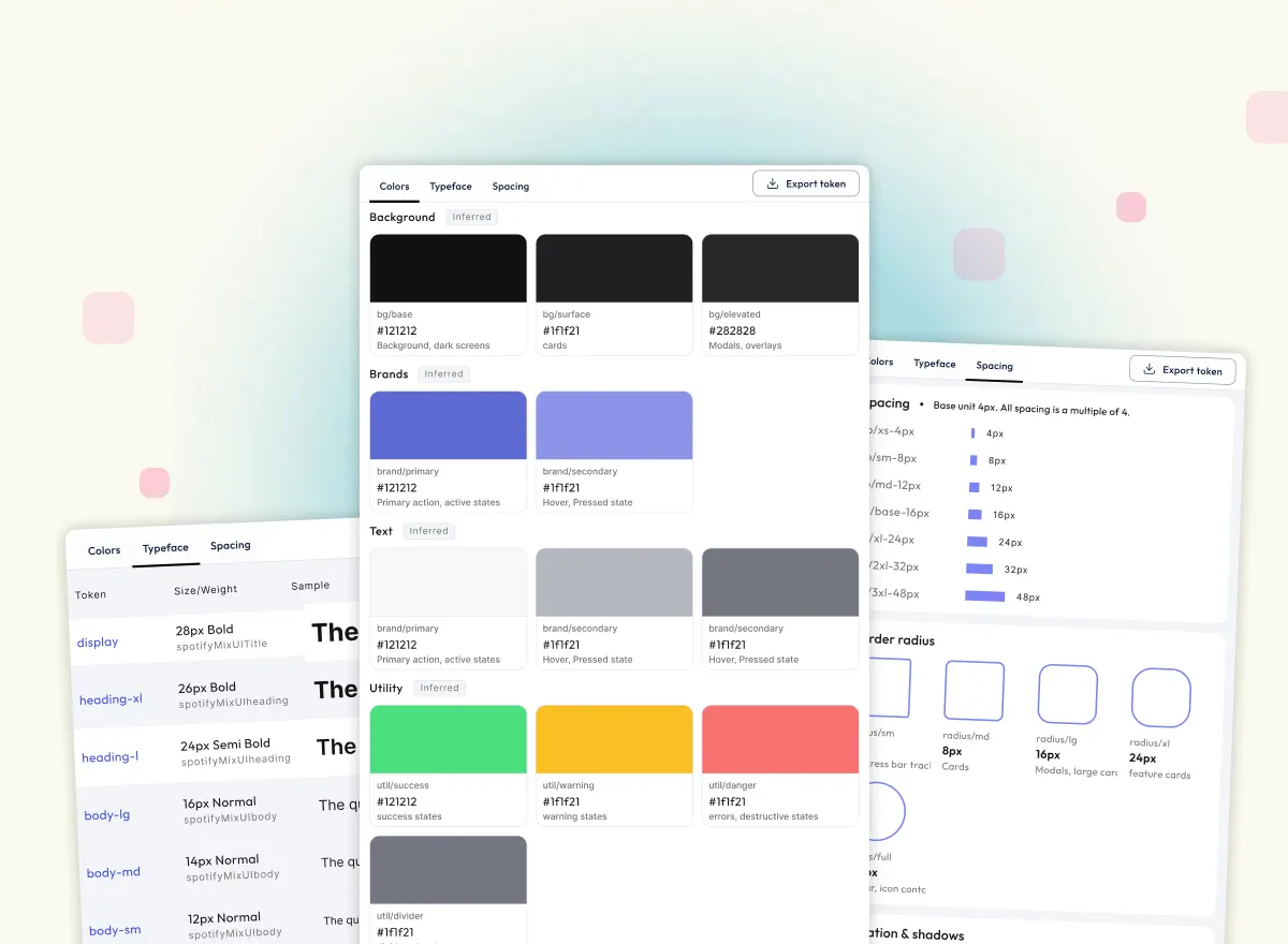
Trace UI pulls the entire design system out of any reference site:
- Primary, accent, and neutral color palettes
- Type scales and line heights
- Border radii, spacing scales, and shadow depths
You can export these directly into your Tailwind theme (@theme in Tailwind v4 or theme.extend in v3) so every section of your landing page stays visually cohesive.
3. Customize and Combine for Your Brand
Trace UI doesn't produce locked-in templates. You get clean, human-readable Tailwind code that is modular and easy to adapt. You can tweak the copy, swap the icons with Lucide or Radix, plug in your color tokens, and ship.
Summary Checklist for Your Next Landing Page
Before pushing your landing page to production, run through this quick audit:
- Hero Headline: Does it clearly state the core outcome in under 5 seconds?
- No Navigation Leaks: Have you removed unnecessary menu links that distract from the main offer?
- "So What?" Test: Are all feature bullet points framed as user benefits?
- Friction Reducers: Is there social proof, a guarantee, or a "no credit card required" reassurance next to the CTA?
- Unified CTA: Do all primary buttons lead to the exact same conversion step?
- Clean, Fast Code: Is your UI responsive, lightweight, and styled with consistent design tokens?
With the right structural framework and tools like Trace UI in your workflow, you can move from inspiration to a live, high-converting landing page in an afternoon.